
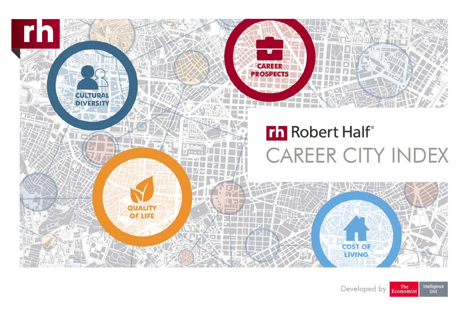
The Career City Index
In partnership with The Economist, we explored a new thought leadership exploring the factors why people would consider moving to a new city for work. Factors such as quality of life, career prospects, cultural diversity, and cost of living were measured by various traits and consolidated into a report to help people better understand which cities reflect their own personal preferences. Custom interactive components were also created for launch.
Digital Thought Leadership


Interactive City Comparison tool

We wanted to give users the ability to dive into the deep research The Economist helped us with. They could adjust ranking weights to see how the 25 cities would rate based on their own personal preferences as well as compare cities against each other to evaluate pros/cons of each.
What we learned:
Users enjoyed using the tool; time on page increased by several minutes
Conversions doubled from the increased interaction time.
We didn’t need to cram all the data we had into the report when users had the ability to discover this on their own. This made future versions of the PDF much shorter and concise.
Interactive Infographic

This infographic was initially a static image asset on the landing page. Using our new interactive tool Ion Interactive, we wanted to explore if making the infographic interactive boosted engagement and conversions.
Using data from the report, we created a ‘Top 10’ list that encouraged users to click and explore. Micro-interactions include trivia questions and click-and-reveal answers.
What we learned:
Time on page increased, but overall conversion wasn’t affected.
Page load times increased by 2 seconds with this additional embedded content. Not a huge deal on this page, but good info as we explored similar projects on more content-heavy pages.
The ROI of the time required to create an interactive infographic wasn’t there, although we used this experiment as a starting point to add other types of engagement to other programs which did return better results.